E-commerce Website Design: Lessons from Top Brands
Summary
This analysis reviews website design lessons from top brands, focusing on elements that drive engagement and conversion. It highlights effective UX, compelling copywriting, and strategic brand storytelling across various e-commerce sites. The insights provide actionable strategies for optimizing website performance and enhancing the customer journey.
Key Takeaways
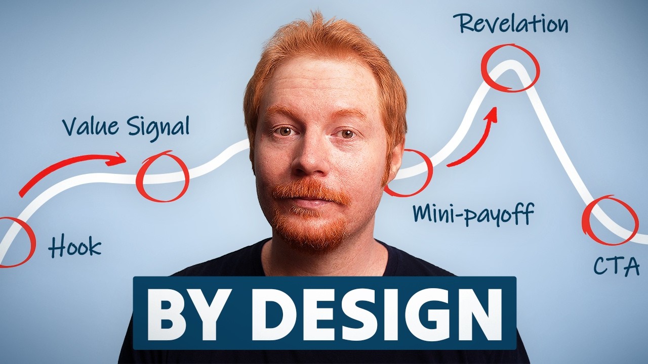
- 1Effective website design integrates strong brand storytelling and product differentiation, moving beyond basic functionality.
- 2Strategic use of push and pull sections on a website balances information delivery with clear calls to action, guiding the user through the funnel.
- 3High-quality, lifestyle-oriented photography significantly elevates product perception and conversion rates, especially in apparel and home goods.
- 4Well-designed navigation, including micro-categories and visual cues, improves discoverability and user experience.
- 5Compelling, UX-friendly copywriting, even in small elements like empty cart states, can significantly enhance brand personality and encourage conversion.
- 6Social proof, ranging from celebrity endorsements to industrial testimonials and everyday customer reviews, builds trust and credibility.
- 7Subscription programs benefit from clear explanations of ongoing value and tiered incentives, fostering long-term customer relationships.
Introduction and Website Focus
The discussion centers on analyzing full e-commerce websites, identifying effective design elements and strategies. The speaker, with extensive experience in building and designing websites since 2017 on Shopify and earlier on WordPress, aims to share insights on what makes a website interesting and effective. The focus for this episode is on full website experiences, with future plans to cover specific funnels.
The analysis emphasizes the importance of desktop experiences, especially for high-value purchases (e.g., AOV over $500) or specific categories like furniture, where desktop traffic remains significant even if initial discovery occurs on mobile. The goal is to extract modules and design principles applicable to various e-commerce contexts.
Syryn Brand Analysis: Missed Opportunities and a Unique Feature
Syryn.com, Sydney Sweeney's lingerie brand, is critiqued for its underwhelming design, lack of brand and product storytelling, and minimal product information. The homepage is described as plain and editorial, with product pages lacking reviews, testimonials, or diverse lifestyle imagery. This is seen as a significant missed opportunity given the celebrity endorsement.
Despite overall shortcomings, Syryn features one notable design element: a 'reveal range' slider on product pages. This slider, with options like 'fully dressed' to 'next to nothing,' visually represents product coverage. While not fully interactive (e.g., not linking to collections), it offers an interesting concept for showcasing product versatility and could be enhanced with clickable options and matching recommended products.
Parachute Home: Brand Immersion and UX Excellence
Parachute Home is lauded for its exceptional brand building, evident in its website and physical stores. The brand successfully conveys a distinct lifestyle and vibe, making it clear that it's a multi-million dollar enterprise. This is achieved through consistent visual identity, including distinct serif and sans-serif fonts for contrast, and high-quality photography.
The website's navigation is highlighted as a strong point, featuring editorial-feeling photography and micro-categories (e.g., 'bedding' broken down by 'fabric,' 'layers'). The use of 'popular' tags and clear sale sections within the navigation enhances user discoverability. Product cards on the homepage utilize hover states to display lifestyle imagery, effectively portraying product comfort and use. The site also effectively uses 'push and pull' sections, balancing educational content with clear calls to action.
Parachute: Copywriting and Product Page Details
Parachute's email popup strategically segments users by interest (bedding or bath) for tailored flows. The empty cart state features engaging, UX-friendly copywriting like 'Life is short, get the linens,' which is both playful and persuasive. This demonstrates how small copy elements can significantly impact user experience and conversion.
Product Detail Pages (PDPs) on Parachute are well-designed, particularly for brands with in-store pickup options. They display real-time availability at nearby stores, leveraging IP address data for location-based information. This feature, combined with beautiful photography and clear brand storytelling, enhances the overall product experience and builds trust.
Gray Matter: Supplement Website Funnel and Social Proof
Trygraymatter.com, a supplement brand, excels in educating new visitors, assuming traffic comes from paid social and is unfamiliar with the brand. The homepage immediately presents social proof (4.8/5 rating) and a compelling headline: 'Strengthen your cognition,' followed by a clear value proposition: 'A daily plant-based drink for calm, focused energy without the prescription or side effects.' This effectively addresses potential user concerns and highlights key benefits.
The site uses a 'challenge-solution-how it works-research' framework, effectively positioning the product. Social proof is strategically varied, featuring 'industrial' testimonials from football players, firefighters, and special forces officers, alongside everyday customer reviews on PDPs. This multi-faceted approach builds strong credibility and trust.
Gray Matter: UX Elements and Subscription Strategy
Gray Matter's homepage includes an engaging module that explains product effects over time: 'first 15 minutes,' 'next 48 hours,' 'no crash ever,' 'week one,' and 'week two onwards.' This dynamic section, with scrolling highlights, manages user expectations and showcases immediate and long-term benefits. The design also incorporates scientific-feeling backgrounds and clear iconography.
The subscription model is highly incentivized and transparently communicated. A 50% off first order for subscriptions is a strong offer. The PDP clearly highlights free gifts (frother, app, cash credit) and free shipping for subscribers, contrasting it with one-time purchases. The 'reason to subscribe' section details a tiered reward system over several months, fostering long-term engagement and demonstrating value beyond the initial purchase.
FAQ
What common pitfall did Syryn.com exhibit in its website design?
Syryn.com, Sydney Sweeney's lingerie brand, showed a lack of brand and product storytelling and minimal product information. This was a significant missed opportunity given the celebrity endorsement and potential for engaging content.
How does Parachute Home enhance user experience on its product pages?
Parachute Home uses beautiful photography and clear brand storytelling to elevate product pages. They also display real-time availability for in-store pickup, leveraging IP address data to provide location-based information, enhancing convenience and trust.
What is Gray Matter's strategy for building credibility and trust?
Gray Matter builds credibility through varied social proof, including "industrial" testimonials from athletes and military personnel, alongside everyday customer reviews on PDPs. This multi-faceted approach effectively addresses different user demographics and concerns.
Key Learning
Analyze your e-commerce site for balanced push and pull sections, ensuring educational content smoothly transitions to clear calls to action. Implement UX-friendly copywriting in unexpected places, like empty cart states, to reinforce brand personality and guide users effectively.
Related Summaries

S15 E8: The Brand Revamp Playbook

The Next Era of DTC
S15 E7: More Website Design Lessons From the Best Brands

More Website Design Lessons From the Best Brands

How To Build A $250k A Month Business With AI

Omnisend Tutorial for Beginners 2026 (Campaigns, SMS & Automations)
S15 E9: The Next Era of DTC

The DTC Playbook Behind RYZE's $600M Mushroom Coffee Empire
Free Course How To Make $100k A Month AI Static Image Ads Step-By-Step

Email Marketing For Beginners 2026 (Step-by-Step Guide)

What Is Semrush? (What Is SEMRush And What Does It Do?)

Watch This If You Have a Service Business

The Blueprint to Monetize on YouTube From Day 1

How To Get Members (Traffic Sources) | Skool News #46

You're Wasting Money Trying to Get B2B Clients

Email Marketing Tutorial for Beginners (2026)

3 Storytelling Email Frameworks That Make People Want More

Before You Fix Your Sales Team, Fix THIS First | The Bedros Keuilian Show E0179

The $3.7 Billion Subscription Machine: How Hims & Hers Disrupted American Healthcare