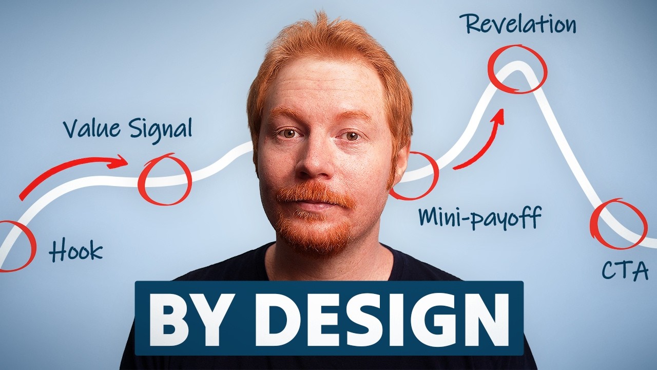
S15 E7: More Website Design Lessons From the Best Brands
Summary
This episode analyzes website design lessons from top brands, focusing on tactical and strategic e-commerce elements. It dissects the user experience, conversion funnels, and branding strategies of several companies, including The Absorption Company, Pulto Tech, and Bioma. Key insights include optimizing homepage layouts, leveraging social proof, enhancing product pages, and implementing effective upsell sequences. The discussion provides actionable advice for improving website performance and driving revenue in the consumer brand space.
Key Takeaways
- 1The Absorption Company effectively uses consistent branding, clear packaging, and a split hero section on desktop for strong visual appeal.
- 2Strategic placement of social proof, like 4.97/30,000+ reviews, is crucial but often hidden, requiring more prominent call-outs.
- 3Problem-solution modules with visual aids and data, such as the 'water spilling from cup' image, significantly enhance product understanding and engagement.
- 4Loading screens with branded animations improve user experience during site transitions, especially for users with slower internet connections.
- 5Optimizing collection pages with H1/H2 headings, subheadings, and descriptive icons boosts SEO and brand perception.
- 6Direct response advertorial sites like Pulto Tech use highly descriptive icons, comparison charts, and psychological pricing to drive conversions.
- 7Bioma utilizes extensive quizzes and personalized product recommendations, pre-filling user data in checkout to streamline the purchase process.
The Absorption Company Website Analysis
The Absorption Company, co-founded by Ian Somerhalder, demonstrates strong branding and website design. Their packaging is consistently beautiful and easy to read, effectively separating products while standing out on shelves. The website mirrors this quality with well-sized elements, from headlines to CTAs, creating a cohesive visual experience.
The homepage features a split hero section for desktop, combining imagery and text effectively. A 'Front Row MD' integration is highlighted, offering a deal for listeners. While social proof (4.97/30,000+ reviews) is present, it is somewhat hidden and could be more prominently displayed, perhaps with a quote emphasizing product absorption.
Homepage Conversion Elements
The Absorption Company's homepage includes a 'problem-solution' module that visually explains product benefits. An image of water spilling from a cup illustrates poor absorption, juxtaposed with text stating, 'Most supplements are not designed for your body to absorb them.' This is followed by data: '77% of Americans take supplements yet over 90% remain deficient in key nutrients.' The solution highlights 'up to 8x more absorption.'
Product carousels allow toggling between 'stacks,' 'powders,' and 'capsules.' The term 'stacks' might be niche, suggesting a need for broader appeal. A 'shop by goal' section acts as a 'pull' mechanism, guiding users to relevant products. A feature section below the essential stack emphasizes 'clinician's choice' reviews, specifically addressing bioavailability and absorption.
Collections Page Optimization
Transitioning from the homepage to collections, a mini loading screen with branded animation enhances user experience, especially for those with slower internet. This small detail contributes to brand perception and uniqueness. Collections pages also feature side-scrolling marquee icons below the headline and subtext, which is a significant SEO unlock.
Most collection pages lack H1/H2 headings and subheadings, which are crucial for SEO. Adding proper descriptions, tags, and collection titles with subheadings can significantly improve page ranking. The Absorption Company's use of descriptive icons, discount call-outs, and ratings on collection pages further aids user navigation and decision-making.
Product Detail Page (PDP) Strategies
On the PDP, the Absorption Company uses a compact header and notification bar. While individual product reviews are shown, integrating the total 30,000+ brand reviews could strengthen social proof. The initial PDP image, featuring three bottles, has excessive white space that could be utilized for animated icons or key benefits.
Key features include clickable ingredients and benefits sections, which could be improved by using pop-ups or slide-outs for better user flow. A 'low stock' call-out and a native-feeling 'subscribe and save' toggle with a 33% discount and free gift offers are effective. The PDP also includes a 'Why it works better' section with infographics and a chart detailing increased bioavailability and absorption, along with month-by-month expectation call-outs for supplement effects.
Pulto Tech Direct Response Funnel
Pulto Tech, with approximately 1 million monthly page views, employs a highly optimized direct-response funnel, primarily targeting mobile users. Their homepage immediately redirects to a product-specific landing page (Fit Light), designed like a VSSL page. This page features a headline, bolded text, a flashing 'Order Now' button, and prominent social proof, including a video player.
Icons are highly descriptive: three people with stars for '100,000+ happy customers,' five stars with a clicking finger for '20,000+ five-star reviews,' and an 86% icon for '86% of users feel less stressed.' The page includes a 'number one doctor recommended' claim, a 'how it works' section, and benefits-driven content like 'calm your mind' and 'deep restorative sleep.' A comparison chart uses green checks and red X emojis to highlight advantages over competitors.
Pulto Upsell and Checkout Tactics
Pulto Tech offers two product options: Pulto Light ($242) and Pulto Fit ($251), with the latter positioned as a 'premium model' with 'best comfort, longer battery.' The minimal price difference psychologically nudges users towards the premium option. A second comparison chart specifically details the differences between these two models.
Upon clicking 'buy now,' a module appears offering '67% off PTO app premium,' followed by another pop-up for '33% off the travel case' (advertised at $33, but priced at $35 in cart). The checkout process pre-fills the user's email from the quiz, and discounts are clearly highlighted in red with crossed-out original prices. However, a $5.99 shipping fee on a $355 subtotal and the price mismatch for the travel case are potential conversion blockers.
Bioma Quiz-Driven Sales Strategy
Bioma.alth, with 1.7 million monthly page views, uses a quiz-driven sales strategy. Their homepage features a clean design with off-white backgrounds and crisp black text. Product images allow users to 'show ingredients,' revealing branded ingredients and dosages. However, direct navigation to PDPs is limited; clicking images or titles does not lead to product pages.
Instead, the site funnels users through a 'Find the formula your body needs' quiz. This 19-question quiz, starting with a male/female selection, guides users through questions about their health goals. Between sections, it provides feedback like 'you're on the right track.' The quiz culminates in a personalized product recommendation, often pushing a specific product or a multi-bottle bundle.
Bioma Personalized Checkout Flow
After completing the Bioma quiz, users are presented with a personalized results page that includes their 'metabolic age' and 'fat burning rate' based on their answers. It then recommends a specific product, explaining its benefits (e.g., 'boosts your own unique gut composition,' 'includes prebiotics, probiotics, and postbiotics'). The page also details how to take the product before the purchase decision.
The final step takes users to a landing page with a personalized coupon code (e.g., 'entrepreneurNick-Feb16') pre-applied, along with a 24-hour countdown timer. This page offers 'subscribe versus one-time' toggles, with price anchoring on a 'most popular' 3-month supply. A mini-chart visually represents projected weight loss based on user data. The checkout process pre-fills the user's email, and discounts are clearly displayed in green for savings and free items.
FAQ
What is the core method or idea in S15 E7: More Website Design Lessons From the Best Brands?
The core idea is: The Absorption Company effectively uses consistent branding, clear packaging, and a split hero section on desktop for strong visual appeal.. This episode analyzes website design lessons from top brands, focusing on tactical and strategic e-commerce elements. It dissects the user experience, conversion funnels, and branding strategies of several companies, including The Absorption Company, Pulto Tech, and Bioma. Key insights include optimizing homepage layouts, leveraging social proof, enhancing product pages, and implementing effective upsell sequences. The discussion provides actionable advice for improving website performance and driving revenue in the consumer brand space.
Which result, metric, or constraint from S15 E7: More Website Design Lessons From the Best Brands should guide implementation?
A key decision anchor is: Strategic placement of social proof, like 4.97/30,000+ reviews, is crucial but often hidden, requiring more prominent call-outs.. Use it as the validation criterion before scaling.
What is the main execution risk to control before scaling S15 E7: More Website Design Lessons From the Best Brands?
Control this risk first: Strategic placement of social proof, like 4.97/30,000+ reviews, is crucial but often hidden, requiring more prominent call-outs.. Treat it as an evidence gate before wider rollout.
Key Learning
This episode analyzes website design lessons from top brands, focusing on tactical and strategic e-commerce elements. It dissects the user experience, conversion funnels, and branding strategies of several companies, including The Absorption Company, Pulto Tech, and Bioma. Key insights include optimizing homepage layouts, leveraging social proof, enhancing product pages, and implementing effective upsell sequences. T
Related Summaries

More Website Design Lessons From the Best Brands

Website Design Lessons From the Best Brands

S15 E8: The Brand Revamp Playbook

Email Marketing For Beginners 2026 (Step-by-Step Guide)
S15 E9: The Next Era of DTC

The Next Era of DTC

What Is Semrush? (What Is SEMRush And What Does It Do?)
Free Course How To Make $100k A Month AI Static Image Ads Step-By-Step

How To Build A $250k A Month Business With AI

Omnisend Tutorial for Beginners 2026 (Campaigns, SMS & Automations)

You're Wasting Money Trying to Get B2B Clients
Email Marketing Tutorial for Beginners (2026)

The DTC Playbook Behind RYZE's $600M Mushroom Coffee Empire

Watch This If You Have a Service Business

The Blueprint to Monetize on YouTube From Day 1

How To Get Members (Traffic Sources) | Skool News #46

3 Storytelling Email Frameworks That Make People Want More

Before You Fix Your Sales Team, Fix THIS First | The Bedros Keuilian Show E0179

The $3.7 Billion Subscription Machine: How Hims & Hers Disrupted American Healthcare